BaronVonGOODness
Graphic Designer
Tag Archives: Design
elbow apple carpet saddle bubble
deployment journal This is the my explanation of time in Iraq
http://www.eacsb.wordpress.com
buy the hardcopy of this book at
GoDaddy

 This redesign was pretty radical. I couldn’t keep all that many elements and still be happy with my design. This was not a design that could just be slightly tweeked
In what I know about godaddy.com they are one of the best resorces for domain names. They are no longer exclusivly a .com location, godaddy is also a .co along with international sites .ca (Canada) .uk (Great Brittain) and so on. Godaddy has become a household name so I felt .com could be dropped from their logo.
I know the company associates themselves with not only their logotype but also that goofy guy and I couldn’t get rid of him. He is such a promonate element in their marketing that it would be too ratical to drop the image. I just aged him a little and made him into a more humanoid figure. I transformed the monkey man into a character somewhat resembling ESPN’s PTI co-host Tony Kornheiser.
Godaddy’s advertising stratigy is to be a fun lively company which airs racey and silly ads. Their spots run during sporting events and other male-centric television events. By making the character vaguely recognizable to the 18-40 male demographic Godaddy is using their logomark in their branding. The new logo is recognizeable and fun but is still more grown up.
Godaddy provides a real important service, and you don’t want someone strung out on crack selling you your domain.. I dropped yellow from their logo all together. I have looked pretty heavily at their branding and their main colors are neon green, green, black and accented by orange. The addition of yellow just muddies up their branding. The simplier color pallet makes it more recognizable.
I changed the lettering to a nascar type of font with the italics to associate their logo with their number one marketing asset Danica Pattrick.
With this new logo and logotype Godaddy has matured into their role as the most important and recognizable web domain company. This new logo refines their branding without growing up too much.
Trent Richardson
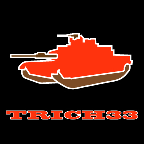 The Brownies havn’t had a BA like him since Kevin Mack. Well hopefully, he hasn’t really done anything yet, but last week he looked like the Brownies finally hit on a draft pick. Trent the Tank, let’s get that going. T-Rich has promise, and I am thinking it’s finally going to be their time.
Fernando Rodney
 Who would have thunk it? Fernando Rodney really is good, and that little bow and arrow thing pretty cool. Good on him, he seems like a nice enough guy. I’m glad he finally put it together for a full year.
The Number Logo
The number logo is the lazy way out in the world of branding. This logo strategy is usually employed by the players who just put up numbers but are not necessarily the most important cultural leader on his team. The number logo is short hand for this guy can play but don’t fallow him on twitter or else you are going to be hearing about their “great workouts” and “wonderful teammates”.
Tom Brady, Chris Paul, Ryan Kessler are sterling examples of this logo. I feel like Eddy Murray could have employed this branding strategy if players were branding in the 70’s. 3,000 hits and 500 homeruns and I don’t think he was ever the most beloved player on any team he played on. Chris Sale is a big, hard throwing, Cy Young candidate and it’s time for a logo.
Typography Anatomy Flash Cards
I was more interested in making functional cards with easily understood definitions than a highly designed piece of art. Using the cards for a quiz changed my outlook, my flashcards have a utilitarian function. My design for the definition side of the card was to have a large headline, and the definition in a smaller font.
This layout has the name of the word, and the definition, right justified, lined as far to the top right, and bottom right as possible. This creates a large white space, and I placed a 7% shadow of my letter in that space. I justified it to the left margin and centered the letter vertically between the headline and the definition. My copy on each card is roughly the same and my definitions all have the same structure. I start each definition with either A, The, or another two to three letter word. I cut the definition length by eliminating phrases like in typography or repeating the name of the character like the aperture is and so on. This gave my definitions a stable format that was easy to read from card to card, and therefore easy to memorize. I have some cognitive disabilities, and due to these limitations, it is difficult for me to memorize long strings of words. The more simple and concise the definitions are the easier it is for me to use them. The formatting was as much about function as it was about style.
The letters I use to group my cards are Q, J, K, A, D, fl, and G. I categorized my flashcards so I could break the studying down to smaller 4 or 6 card groups. Since I had this idea of having these seven letters I put all seven letters on each card as an additional style element. On the illustration, I made my letter simple. I used a basic serif font, and pointed at the desired area of the letter with a 30% grey carrot. Both the front and back of my flashcards are utilitarian in design. I made sure that my cards were as functional as possible. I got an A on the test the cards were used for. That shows the effectiveness of the flashcards.
Jordan after Jordan
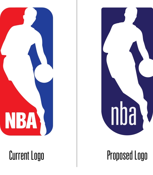
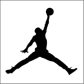
The most recognizable brand is that of one Michael Jordan. What happens when the kids no longer know who Jordan is? No matter what the media says people are not going to clammier for his image anymore sooner than later. There needs to be a transition period between Jordan and who ever is next, and I don’t see that player on the sports landscape right now, and nike is going to need to have some players fill the void for a little while.
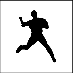
This first image of Jeter and he’s already almost forgotten at least outside of New York so he isn’t really a placeholder he just has worn Jumpman cleats for the last 10 years or so the first step is to let him, Wade and Melo wear their own silhouette. We all know Jordan, but sooner than you would think the kids wont. I’m not saying get rid of Jordan just expand your brand. This is a perfect chance to transition of the next era of Jumpman.
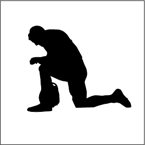
Don’t get me wrong Jordan’s great, and he’s built a cool brand, and people love Jordans. Let’s see where we can go with this. I know this is probably blasphemy to even have Tebow and Jordan in the same article but hear me out. If Tebow is going to be relivant that means he won the starting job in New York, and the team is already a pretty good team, and if he starts and is just not terrible then they’ll more than likely make the playoffs and say that have a running back go crazy and Tebow doesn’t completely blow it. I’m just saying stranger things have happened, Trent Dilford has a Superbowl ring, and he was OK but not Hall of Fame, and I think Tebow could possible be as good as Trent Dilford maybe. If the team wins the superbowl and he is somehow the QB then he will be immortal, He’s got a signature move already, I mean, nike would be stupid not to just have that on the back burner, in the 1 in 50 chance in which that scenario actually happens or something equally unlikely then they’ll be ready.
I think that most dynamic players out there now, with the potential to be able to exemplify the silhouette design are Timmy Lincecum and Rajon Rondo. They have distinct body position in their specific sport and both guys are world champions. I feel like no players should even be in the same time article as Jordan unless they have one. I put some of those green shoes on Rondo because not many other people in the league with the NBA Jam look.
