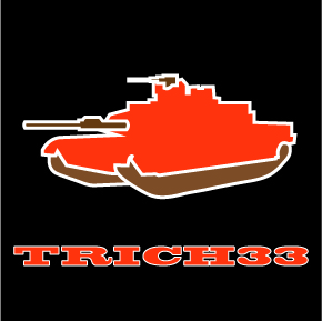
 The Brownies havn’t had a BA like him since Kevin Mack. Well hopefully, he hasn’t really done anything yet, but last week he looked like the Brownies finally hit on a draft pick. Trent the Tank, let’s get that going. T-Rich has promise, and I am thinking it’s finally going to be their time.
BaronVonGOODness
Graphic Designer
Tag Archives: vector
T-shirt project
The clock is a 1960’s style Mickey Mouse clock. The hands on the clock are Mickey’s arms. I used the arms to point at my words, making a connection between my image and my words. The words I associate most with this clock are related to Americana. In the process of thinking of American icons I thought of the reason why I was associating this clock with that theme. I had to step back from the object itself and examine the idea behind it. This clock is literally one of hundreds of different Disney clocks. Each clock uses the characters arms as the hands. The Disney clock is a cultural staple. Most people can remember a Disney clock from their past. These clocks are designed in a whimsical manner, which lends themselves to its target audience. Children are the predominate consumer of all Disney merchandise. I personally have always had some reservations about the idea of marketing a product to children. To me the concept of marketing to kids reminds me of Nazi Germany. I know the reference is a bit extreme, but the Nazis indoctrinated their kids to hate the Jews, and all Disney is doing is telling kids to love their anthropomorphized mice and ducks. I played with this concept for my words, whether Disney was doing effective branding or if they were indoctrinating our youth with the love of their products. Brand and Brainwash flow very nicely and I think those two words sum up my stance on my object.
My T-shirt is a navy blue V-neck with red-orange lettering and illustration. I choose the quality blue V-neck because I wanted my T-shirt to look like a quality retro shirt. The shirt should convey the same feeling as the object. The lettering I picked is red-orange, because I wanted a color that would stand out. The font I chose for my letters is a condensed sans serif. Since brainwash is such a long word and brand is a relatively short word I chose this font to balance the piece. This project was difficult for me. Once I had a clear vision of how I wanted it to look it became one of my favorite projects.
Baron VonGoodness

Baron VonGoodness is my little alter ego. Baron comments on different logos and branding in sports, he specializes in players individual logos. I like the idea of players cultivating their own personal brand. It really is a necessity in professional sports. It seems like a really narcissistic thing to do. I love it. It is an unavoidable part of modern sports. Lebron is the best at it, he wears t-shirts with his face and logo on it and doesn’t even bat an eye. Branding is the most interesting new trend in the field of sports design.


